Drawing beautiful maps using Julia
In todays post, we are going to learn how to draw a beautiful map using Julia. For a long time, I have used a combination of ggplot2 and sf in R to draw all my maps. I have tried on a few occassions to port my mapping over to Julia, but the maps I have been able to draw, so far, have been terrible. Until now...
So, we are going to go over the following processes towards drawing a good map:
Import a shapefile of a geographic region to plot for our map
Import GPS records for a focal species from a .csv file
Plot the GPS records over the shapefile we imported
Some basic editing of the map appearance to make it look beautiful
Session setup
As always, the first thing we need to do is download and load the required packages to perform these operations.
# Download required packages, if necessary (remove # to evaluate code)
# Pkg.add(["GBIF", "Shapefile", "CairoMakie", "AlgebraOfGraphics", "DataFrames", "CSV])

# Load required packages into current session
using Shapefile              # Import and manipulate raster data (e.g. .shp files)
using CairoMakie             # Plotting utilities
using AlgebraOfGraphics      # Plotting utilities
using DataFrames             # Create and manipulate DataFrame objects
using CSV                    # Import and process .csv files
using GBIF                   # Plotting
using SimpleSDMLayers        # Plotting
using Colors                 # Plotting
Download GPS data
The next step is to load the GPS data we want to plot. We are going to import our own file containing GPS data (e.g. a .csv file). Alternatively, we could download data straight from online repositories (e.g. GBIF).
# Import .csv file containing GPS data
df = DataFrames.DataFrame(CSV.File(".\\_assets\\data\\001_drawing_maps\\senecio_gps.csv"));

# Show just the first 10 rows of GPS data
first(df, 10)
10×3 DataFrame
Row │ scientific longitude latitude
│ String31 Float64 Float64
─────┼───────────────────────────────────────────────
1 │ Senecio madagascariensis 30.6458 -29.8125
2 │ Senecio madagascariensis 30.2292 -29.5208
3 │ Senecio madagascariensis 31.2292 -25.5208
4 │ Senecio madagascariensis 30.1875 -29.5208
5 │ Senecio madagascariensis 30.6458 -29.7292
6 │ Senecio madagascariensis 30.9792 -29.6458
7 │ Senecio madagascariensis 31.0625 -29.7292
8 │ Senecio madagascariensis 30.3542 -30.3125
9 │ Senecio madagascariensis 30.6042 -29.7708
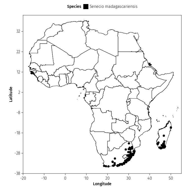
10 │ Senecio madagascariensis 30.6875 -29.7292Voila - We now have 136 GPS records to work with.
Load Africa shapefile
We are now going to load a shapefile containing a map of the countries of Africa using Shapefile.jl. This map is going to be our base layer.
# Import the .shp file using Shapefile.jl
# Downloaded from: https://geoportal.icpac.net/layers/geonode%3Aafr_g2014_2013_0
table = Shapefile.Table(".\\_assets\\data\\001_drawing_maps\\shapefiles\\afr_g2014_2013_0.shp");
The Africa map is currently stored as a Shapefile.Table, not a map. In the next section, we will need to convert the Shapefile.Table into a map to visualise the map.
Load Africa shapefile
Before we do anything else, we are going to change the theme/appearance of the map that we are going to make. This is just my personal preference, so feel free to remove or edit, to your preference.
# Set map theme for AlgebraOfGraphics.jl
set_aog_theme!()
update_theme!(
    Axis = (
        topspinevisible = true,
        rightspinevisible = true,
        bottomspinecolor = :black,
        leftspinecolor = :black,
        xtickcolor =:black,
        ytickcolor =:black
       )
);
Plot map
Now we are going to build our map layer-by-layer. This process is similar to how ggplot2 makes figures in R, as we are going to effectively stack different layers of information over one another to make a map. The first layer we are doing to make is the base layer containing the map of Africa.
# Step 1: Create a raster layer with the African shapefile (.shp)
layer_map = geodata(table) *
        mapping(
            :geometry
            ) *
        visual(
            Poly,
            strokecolor = :black,
            strokewidth = 1,
            linestyle = :solid,
            color = "white"
);

# Print Africa map
draw(layer_map);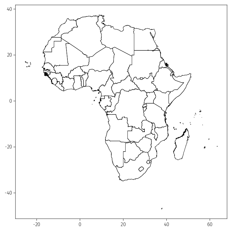
The next step is to create a layer containing the GPS points that we want to plot over the Africa map. We need to pass the DataFrame containing the latitude and longitudes for each GPS point and a column containing a text identified with the species/taxon name to plot in the legend.
# Step 2: Create a layer with points for the GPS data
layer_gps = data(df) *
        mapping(
            :longitude,
            :latitude,
            # Changes the legend name
            color = :scientific => "Species"
        ) *
        visual(
            Scatter,
            marker = :circle,
            markersize = 12.5,
);
The last step is to plot the two layers of information to make our final map.
# Set all points labelled as Senecio madagascariensis to black colour
colors = ["Senecio madagascariensis" => colorant"#000000"]

# Step 3: Combine layers to make map
map_final = draw(
    # Pass layer containing base layer shapefile
    layer_map +
    # Pass layer containing GPS points
    layer_gps,
    # Define x and y axis limits, axis tick range and axis labels
    axis = (
        limits = ((-20, 55), (-38, 40)),
        xticks = -20:10:55,
        yticks = -38:10:40,
        aspect = 1,
        xlabel = "Longitude",
        ylabel = "Latitude",
    ),
    figure = (
        resolution = (750, 750),
    ),
    # Place the legend on top of the figure (position = :top)
    legend = (position = :top, titleposition = :left, ),
    palettes = (color = colors, )
);